Evermerge:
Updated Marketplace
Company: Big Fish Games // My Role: Senior UX Designer // Additional Core Team: 2 PMs, 1 UX/UI Designer, Engineers
Contributions:
Owning Kickoff Meetings & Handoffs
Feature & Competitive Analysis
Creating Wireframes, Flows and Prototypes
Guiding and Reviewing UI
Documentation, Creating Jira Tasks and Version Planning
Tools:
Figma
Miro
Confluence
Optimal Workshop
Mobile Devices
Overview
The problem:
What can we do to improve spend within our in-game Market?
Evermerge at this time was 3 years into its lifecycle, had been an influence in the mobile merge genre for other companies.
The Result:
After running four A/B tests to compare different updates, changes, and new content in our organization, we noticed a small increase in player spending due to merging markets and adjusting some processes.
The Approach:
6. Preparing for A/B Testing
7. Validating Updates Felt Good
8. Driving Documentation & Development
9. Adjusting From Technical Difficulties
1. Assessing Our Market
2. Analyzing Competitors
3. Finding Our Solutions
4. Simplifying and Updating Friction Points
5. Planning the Market Holistically
Assessing Our Markets
I started my research by examining the markets in the game, each situated on a distinct island. I reviewed the items for sale, their functionalities, identified any issues present, and observed the visual design of each market.
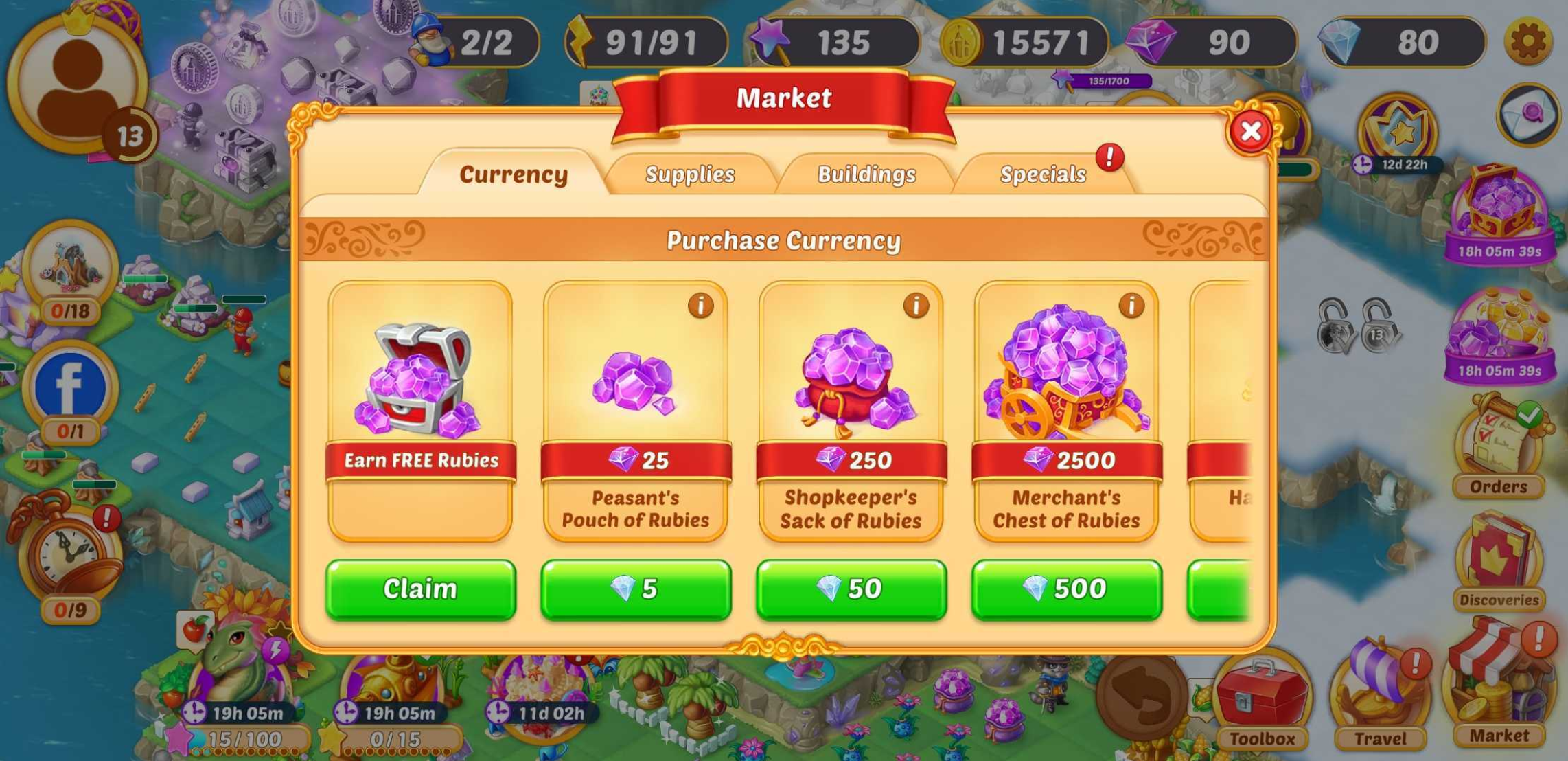
Old Market 1 (In-game Currency and Items)
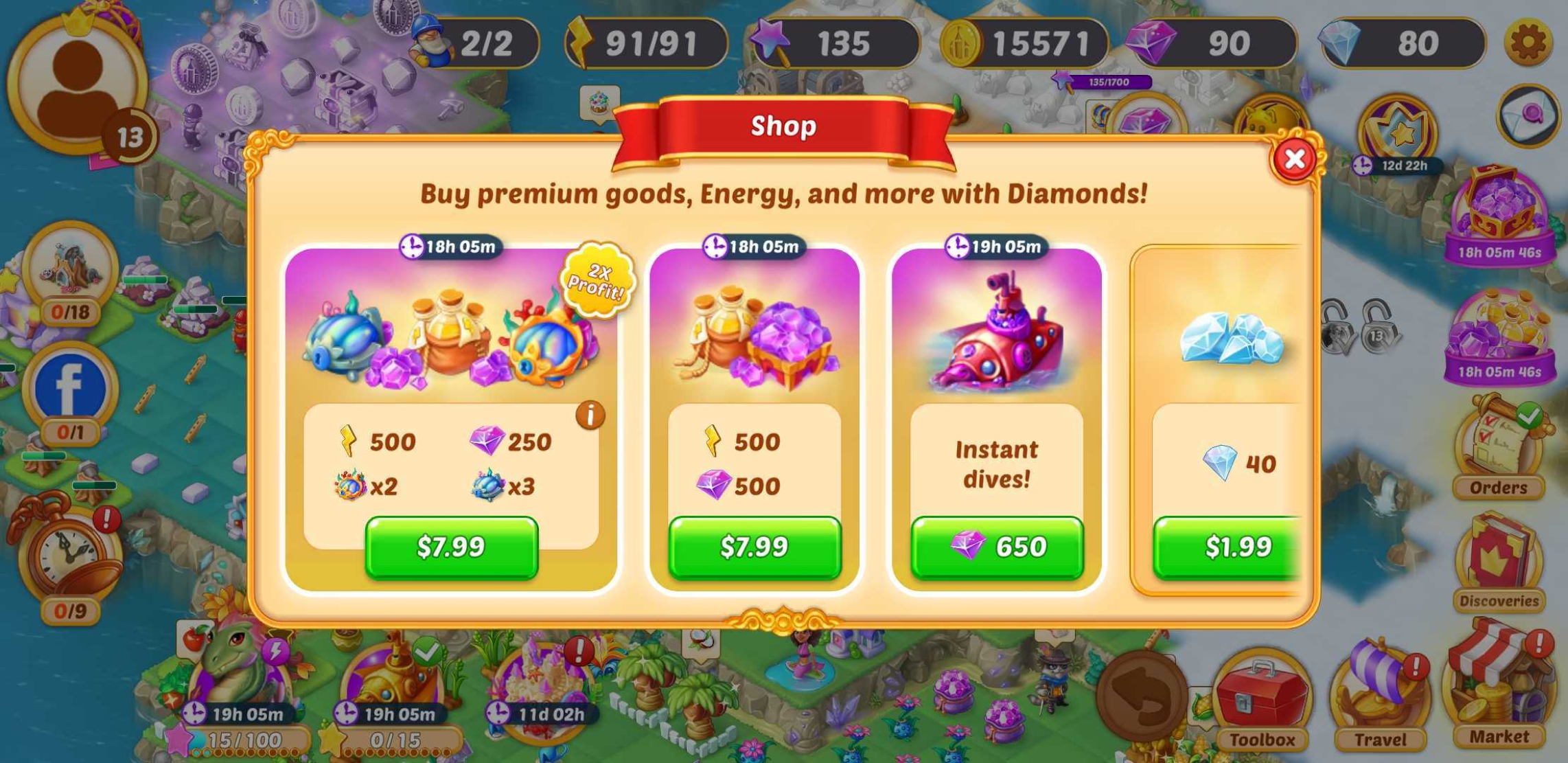
Old Market 2 (Hard Currency Purchases)
A few menus and interstitials at a glance
2. analyzing competitors
To see where we stood compared to other games, I compiled data on comparable mobile game markets that shared similarities in genre, device orientation, or a popular presence in the app store.
Markets from similar Game Genres & Formatting
3. finding our solutions
After discussing with our Product Managers and getting insights from our Data Science and User Research teams, we outlined some changes to enhance Market performance.
Changes to explore:
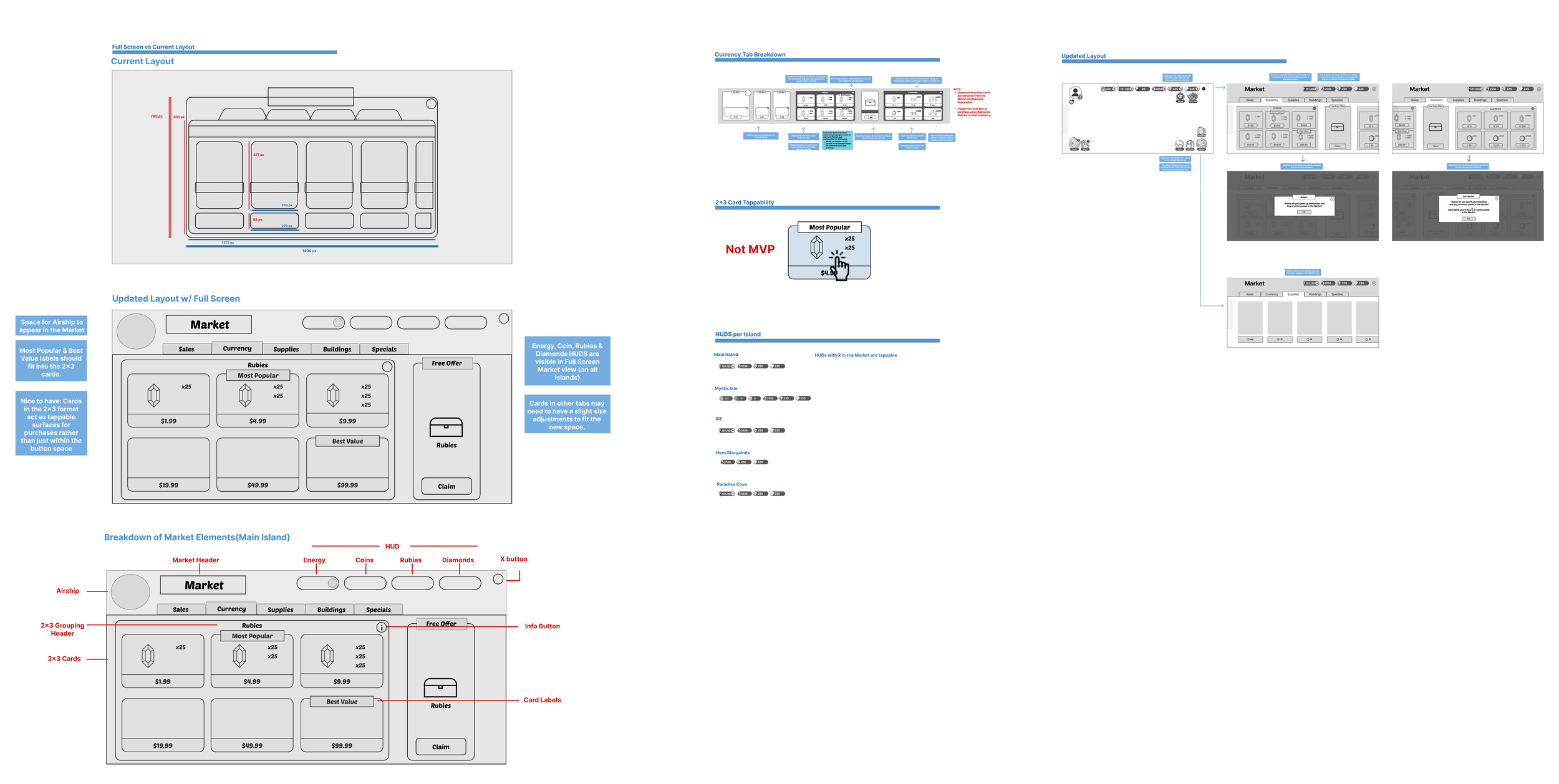
Full-screen view
Consolidating Sales in the Market to a new location
Grouping all currencies in one tab instead of separate markets
Introducing a new format for simpler price comparison for major currencies
4. simplifying & Updating Friction points
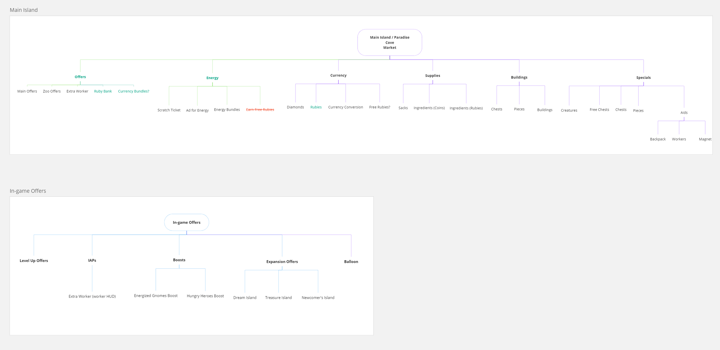
With our goals and challenges set, I started organizing the information structure for each island's markets. I made changes for clarity, removed duplicates, and included new requests.
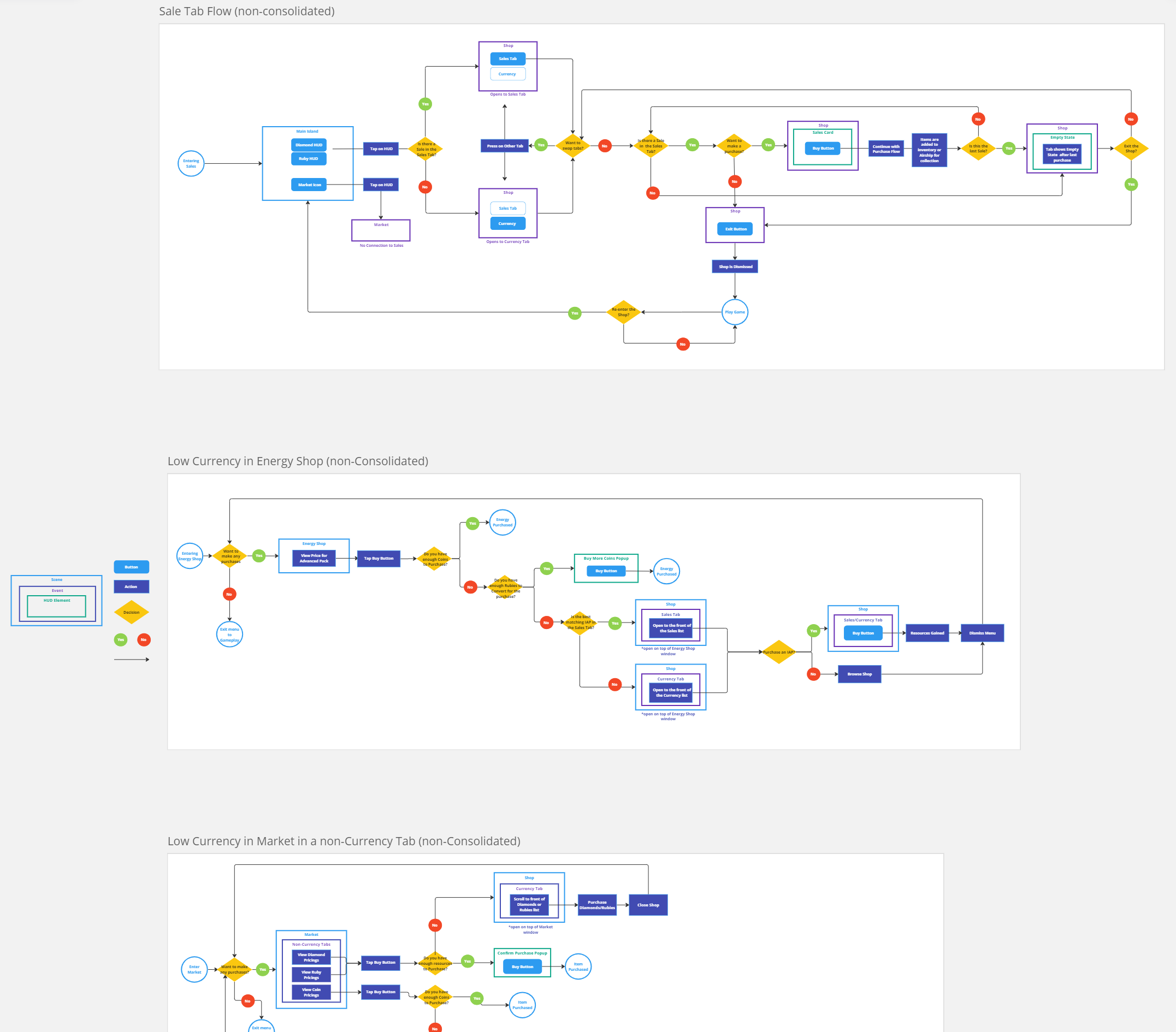
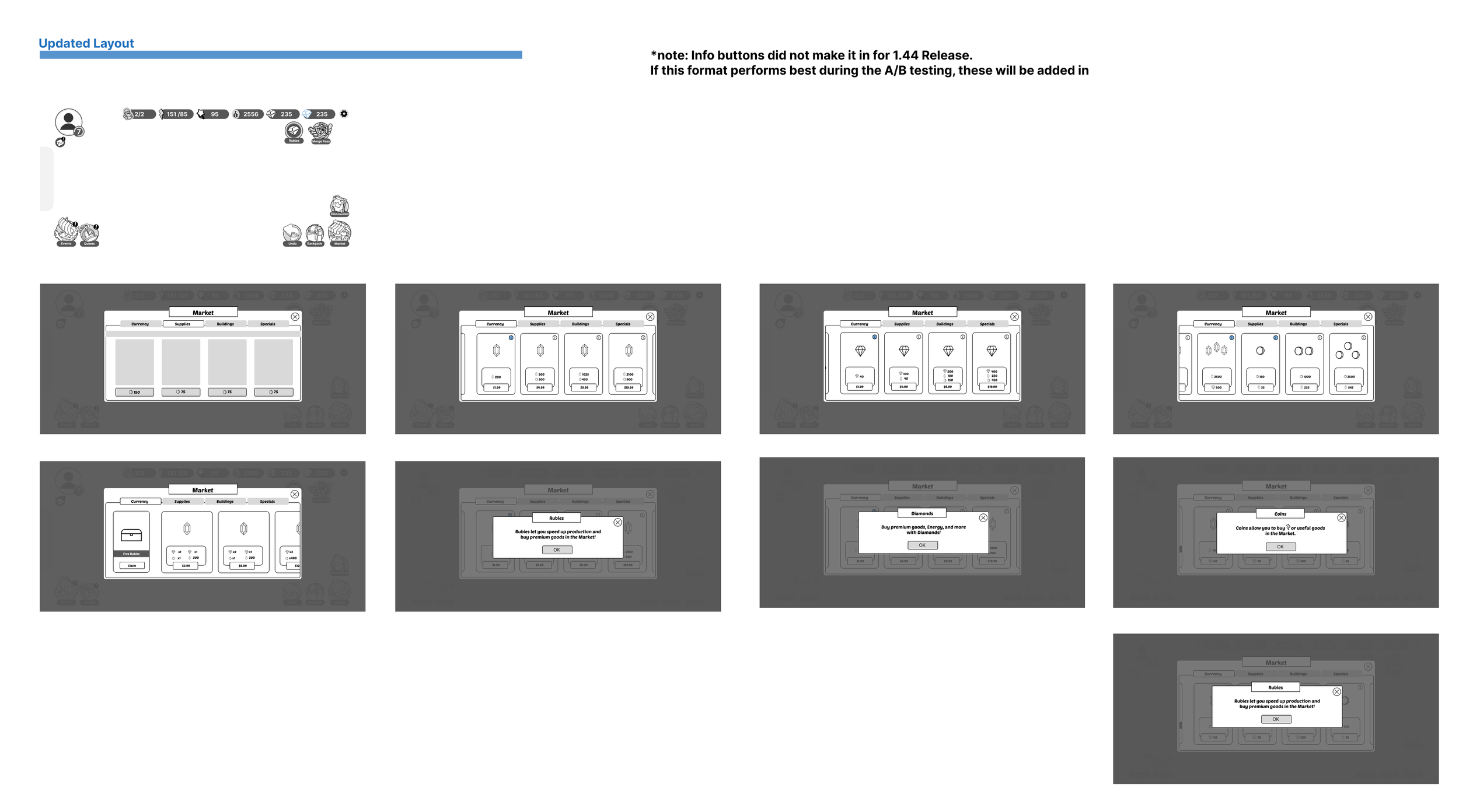
Flows were updated for each market by incorporating the new menu contents and adjusting the Market entry points (tapping HUD/Market icons) for easier access.
Adding new Tabs and removing Redundancies in the Market
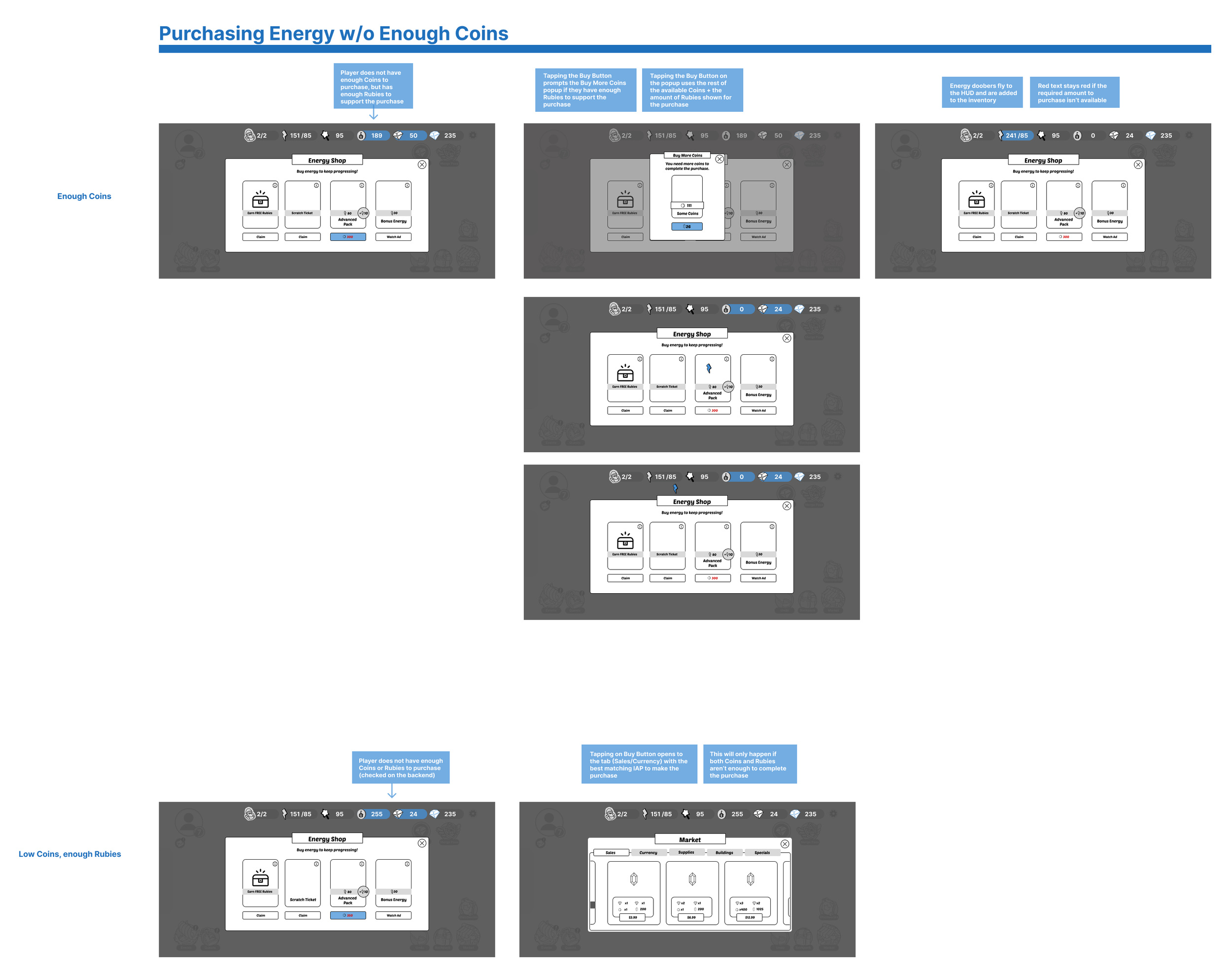
New flows for Low Currency scenarios in Various Tabs
5. Planning the Market holistically
We updated the Currency section and considered combining other shops in the Market to reduce on-screen elements, like the Energy Shop and Ruby Bank.
I also wanted to find a more playful way to showcase restocked items that match the market theme. I aimed to highlight Seasonal and Rare items to draw more attention to them in the market. This would provide us with more chances to promote these items for future event planning.
Sales and Sold Out exploration
Adding the Energy Shop into the Market
Seasonal and Rare Items
6. Preparing for A/B testing
To make it easier to track our changes, I divided the Market update into smaller parts for performance testing and to help players adjust to the updates.
V1-V5 would solely focus on changes for Currency, Sales, and low currency modal behaviors before moving into other Market areas.
V1: Consolidating All Purchasable Currencies in One Tab and Menu
V2: Adding a Sales Tab for bundled purchases
V3: Updating modal behavior for Low Currency situations
V4: Comparative formatting for Hard Currencies + full screen view
V5: Best Value/Most Popular labels
7. Validating updates felt good
To feel out the flows, sizing and interactions, I created wireframes and workable prototypes.
After reviewing these internally with PMs, Designers, UI and Art, I provided our User Insights (UR) team with the prototype to test with some of our users.
Figma Prototype for the V4 Market.
The results were positive and reportedly had the least amount of suggestions for improvement for any features we had tested to this point.
Feedback:
Players liked the market updates and found it convenient to have everything in one place for purchases.
Players appreciated the new way to enter the Market and easily find the store section they needed.
A suggestion was made to compare in-game currency prices with real-world money. It wasn't added due to space constraints and a desire for simpler visuals.
8. Documentation & Development
Figma and Confluence were used for sharing information to our in-office and remote developers for new designs. This included visuals (wireframes, screenshots, and prototypes gifs for complicated flows), thorough breakdowns of each Version release’s content and new flows, and UI details for appearance, functionality and animations.
As the owner of the feature, I created all the Jira tasks with user stories, descriptions, and acceptance criteria for this feature's development.
Some Documentation for the HUD in the Full Screen View
9. adjusting from technical difficulties
After features were implemented in a build, internal playtests were run for feel and feedback. We discovered at this point a few areas that needed adjustments due to technical limitations.
Iteration areas:
Ordering of the cards within the currency scroll list
Adjusting tabs and HUD layout in full-screen Market to accommodate the Market with the longest HUD list.
Takeaways
Observing the results of our A/B testing, we found that the consolidated markets were performing better than the separate markets for spend as we had hypothesized.
Areas where things didn't go as expected:
The new Sales Tab affected sales of Bundle deals in the Currency tab.
Though tapping on a Currency HUD to see the Market currency was smoother, players spent more when scrolling through the main menu.

